Arrow: Physiotherapy and RMT
Fall 2023
This project was for a client that requested a new logo for their physiotherapy clinic that they had planned to merge with another clinic. With this merge they needed a new logo that would capture a new look for their brand. With this in mind I did some research with to understand what would be needed for this project and got to work.
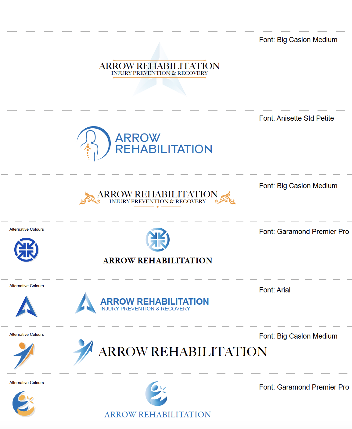
The initial iteration consisted of a series of example logos which served to give the client inspiration and an idea of my capabilities. These were created based on my understanding of physiotherapy clinics and inspiration from other clinics and websites such as instagram and pinterest.
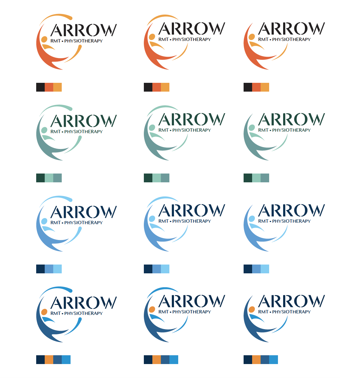
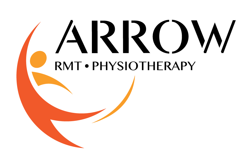
After several iterations and ideas that were thrown around, we decided that a vibrant illustration would make the logo more appealing. Before this realization we were going towards a simpler logo with just text, which the client received feedback for being to boring and simple. After this we discussed adding an illustrated element that would make it more interesting. With this I created an arrow figure that gave off a positive energy similar to that of someone who would have gone through a successful physial rehabilitation. After seeing this idea, we moved onto the next stage, where I layed out a document of various colours and minor alternative designs. They chose the orange and yellow variation in the top right and it was time to move to the final phase.
Reflection
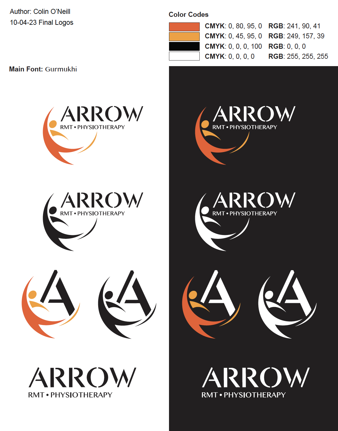
After 12 iterations, the final logos were sent to the client. I sent a package that ensured the clinic would be set with a series of different logo variations they could use for all types of brand material. This project added to my work with branding and throughout the different iterations I was determined to visualize the clients ideas and ensure that he would be happy with the end result. In the end I was glad that they were pleased with the design and I am excited to see how this clinic develops with the logo that I created for them.