Brochure Design
Summer 2021
In the Summer and Fall of 2021, I was hired as a Graphic Designer at a Biotech Manufacturing company called Precision NanoSystems Inc. During my time at PNI I worked on a variety of graphic design projects which included posters, slide decks, flyers, social media graphics, brochures and scientific diagrams.
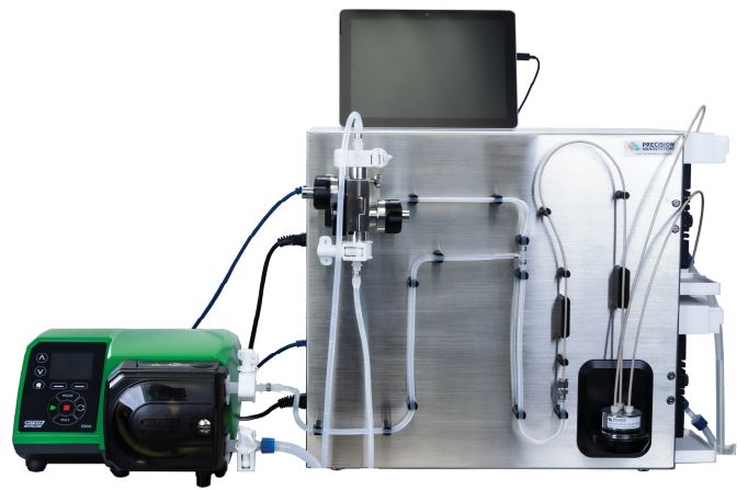
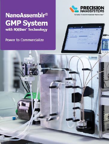
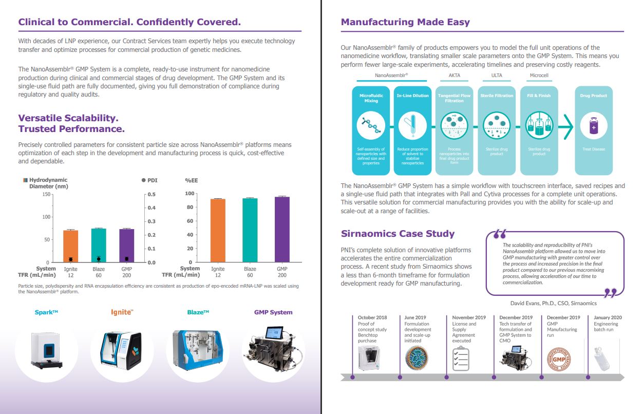
The project I have displayed here is the GMP System Brochure. This brochrue would be given to potential clients to inform them about the capabilities of PNI's GMP System which is one of the main genomic development instruments that they manufacture.
Design Process
Look through past brochures to get ideas and understand brand consistencies
Look over the internal brochure standards guide
Work with the product marketing manager to understand their vision
Look over the creative brief and gather the necessary assets and diagrams
Begin drafting ideas and arranging content in a new InDesign document
Create a draft and share it with the graphics team and product marketing manager
Finalize content and share it with the marketing department during our meeting
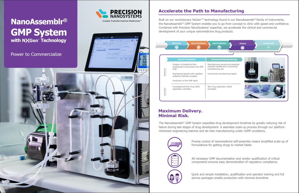
This threefold brochure would be able to solve the problem related to the lack of available information about the GMP by having this short document explaining what this technology can do. The brochure will also always be available on PNI’s website for anyone who is interested and preparing for the commercialization of their drug product.
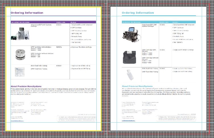
Each instrument is associated with a certain colour. The official colour of the GMP System is “Scale-up Purple” but for the brochure, there were special instructions to try and avoid using this colour since the main colours are orange, teal and blue from the logo. The GMP System was different from its counterparts in that it did not share a colour with the PNI logo and had a more industrial look to it.
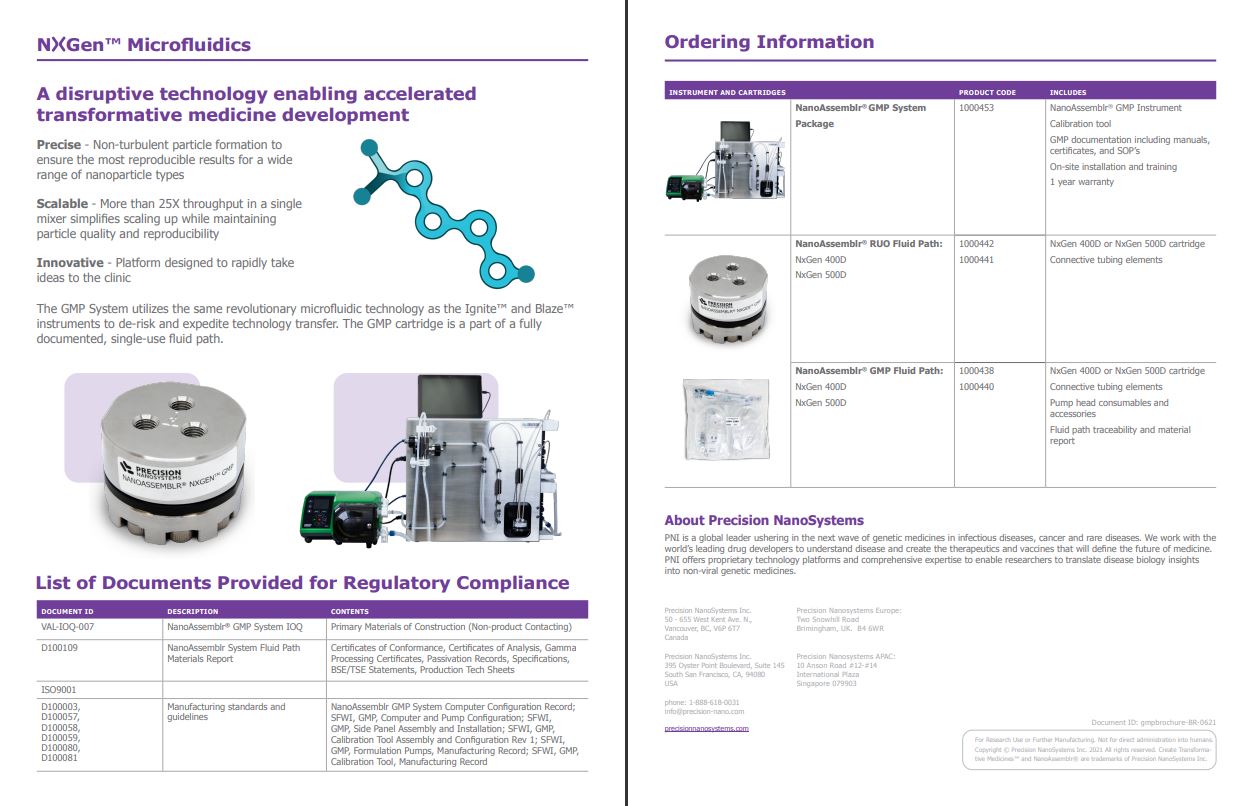
Initially the CEOs wanted it to be Blue to match other brochures, but I thought of making this unique to the GMP and made one version have a purple theme. After the review, it came back to me, and they had chosen to go forward with the purple version, hightlighted in yellow in the image on the right.
Reflection
This brochure was one of the most complex projects that I worked on throughout the term which in total took around two months to get completed. This project required significant collaboration with one of the product marketing managers to get all the content together and back and forth conversations about revisions and content updates. This was a great opportunity to work with others in the marketing department and produce a clean graphically pleasing document.